You may have noticed that your phone or laptop looks different lately. The clean, flat look has given way to something softer and shinier, full of light, blur, and depth. Transparent panels, subtle shadows, and textures that seem to move beneath your fingertips. It is not the first time our screens have shifted form.
Over the past two decades, digital design has travelled a fascinating path: from the leather-stitched textures of early iPhones, to the minimalist flatness of the 2010s, and now to the glossy, semi-realistic interfaces that define much of today’s digital world. These shifts are more than stylistic changes; they reflect our ever-evolving relationship with technology. Today, we will explore these philosophies and the principles that have defined each era of user interface design.
In the late 2000s, with the mainstream introduction of smartphones, Steve Jobs insisted that digital experience should mimic real-world textures to guide users through unfamiliar territory. As a result, designers borrowed from the physical world to make the digital one feel approachable. This era, known as skeuomorphism, was defined by faux wood shelves in iBooks, green felt tables in Game Centre, and shiny buttons that glistened like metal, all reassuringly reminiscent of their real-world counterparts.
Even Microsoft’s glossy Windows 7 interface followed this ethos, layering reflections and shadows to make interaction tangible. Skeuomorphism served as a bridge between material experience and digital abstraction, teaching users how to interact with and trust a screen.
By the early 2010s, skeuomorphism’s charm had begun to fade. We no longer needed to be taught what a button was. In 2013, Apple unveiled iOS 7, a radical visual overhaul that stripped away shadows, gradients, and stitched textures. What remained were clean lines, bold colours, and razor-thin typography.
Microsoft had already taken a similar approach with its Metro design language in Windows 8 and 10: flat tiles, crisp icons, and no hint of physical mimicry. Flat design symbolised confidence. Users no longer needed visual metaphors to understand software. The screen embraced its own nature, a glowing digital surface rather than a clumsy imitation of wood or paper. Brands rushed to follow: Google, Airbnb, and even Pringles simplified their logos, shedding dimensionality for modern sleekness. Yet, in chasing purity, something was lost. Flat interfaces sometimes became too abstract, making it harder to distinguish one element from another. The pendulum had swung from realism to reductionism.
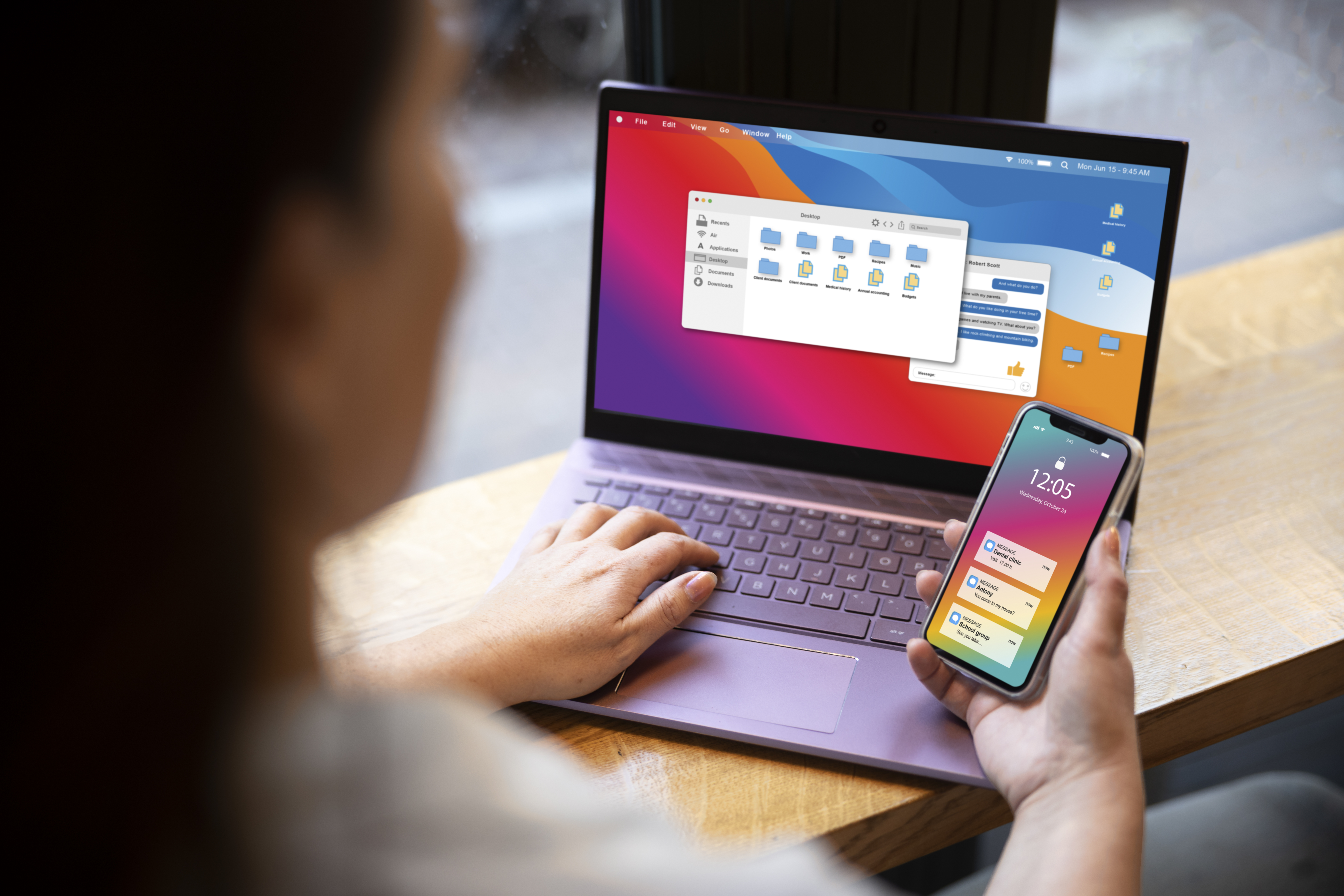
Now we find ourselves in a new phase, not a return to skeuomorphism but a reconciliation. The latest generation of interfaces, seen in Windows 11, iOS 26, and Google’s Material Design, blends flat minimalism with subtle realism. Coined by designer Jason Kelly in 2019, neumorphism fuses neo (new) and skeuomorphism, describing a style that reintroduces depth and tactility through soft shadows, translucent layers, and smooth gradients.
The reason for this change is functional as much as it is aesthetic. Pure flat design often confuses users; neumorphism restores visual hierarchy. Depth, blur, and lighting guide the eye, distinguishing what can be pressed or moved. In an age edging towards spatial computing with the Apple Vision Pro and Meta Quest, design once again borrows from the real world, not to imitate it, but to bridge our world to the digital one.
Overall, interface design has evolved in tandem with our digital literacy. We began by imitating the real world through skeuomorphism, then rejected it in favour of flat abstraction, and now synthesise both in neumorphism’s subtle realism. Each aesthetic mirrors its moment, how much we trust our screens and how deeply we inhabit them. Our interfaces have moved from leather to liquid, no longer pretending to be real objects; instead, they have become their own kind of reality.
Another article you may enjoy: https://thebadgeronline.com/2026/01/lewes-stem-fair-bringing-science-to-the-community/